When people land on your website or profile, they are usually there for a reason. They are looking for clarity. They want to understand what you offer, who it is for, and whether you feel like someone they can trust.
Images play the same role as words. The most reassuring visuals tend to be clear, simple, and easy to take in. They do not compete for attention. They allow the eye to arrive naturally and stay without effort.
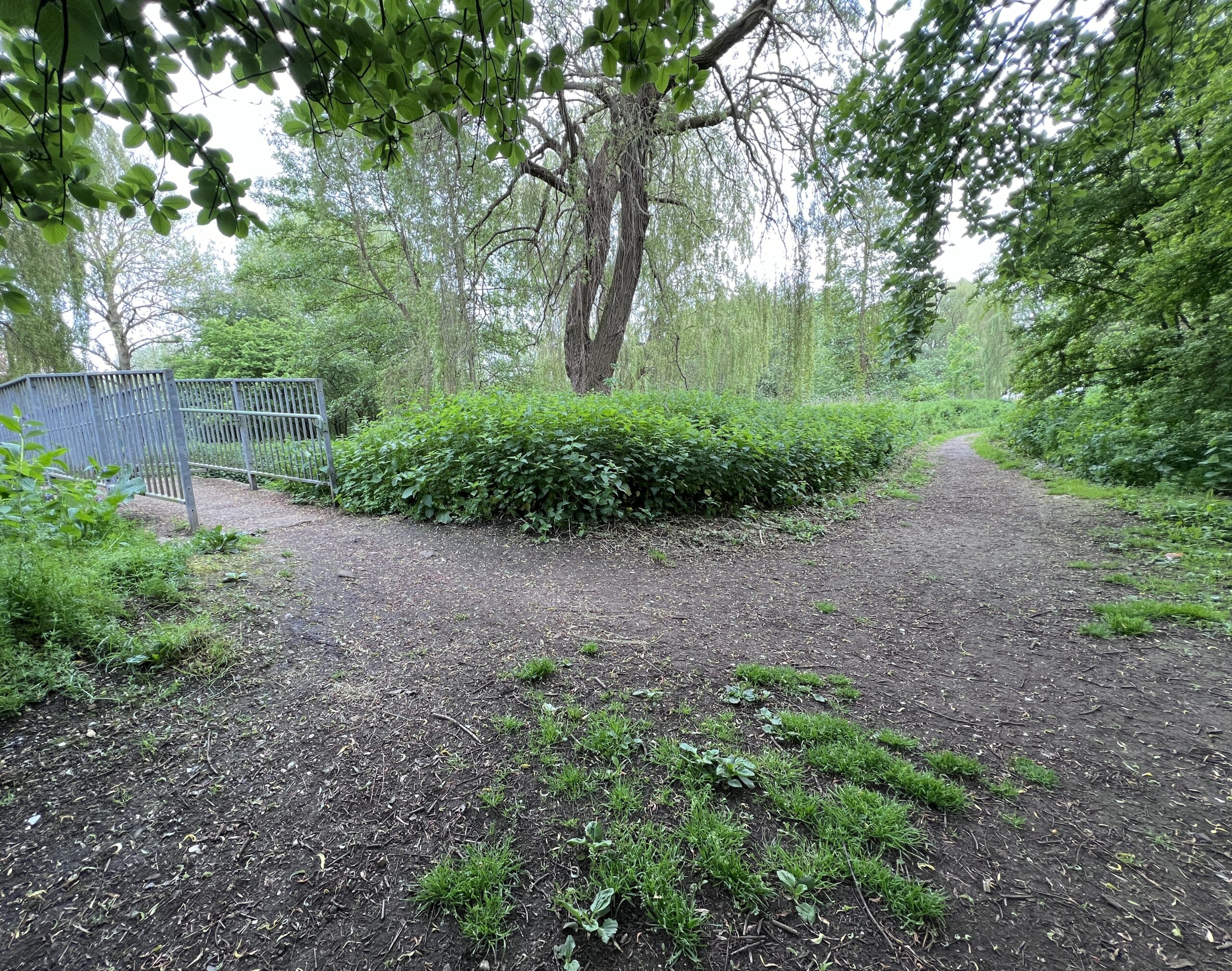
Soft, gentle imagery works in this way. It does not demand a reaction. It creates space.
Soft imagery feels safer because it reduces pressure. Clarity, simplicity, and softness together create a sense of steadiness and timelessness. They signal care and intention rather than performance.
When images feel overly posed, visually busy, or sharp in tone, they can create distance. Strong contrast, hard angles, bright colours, and too many visual elements may look impressive, but they often overwhelm rather than invite.
For many thoughtful business owners, visual softness feels like being quietly understood. That feeling of being held is where trust begins.
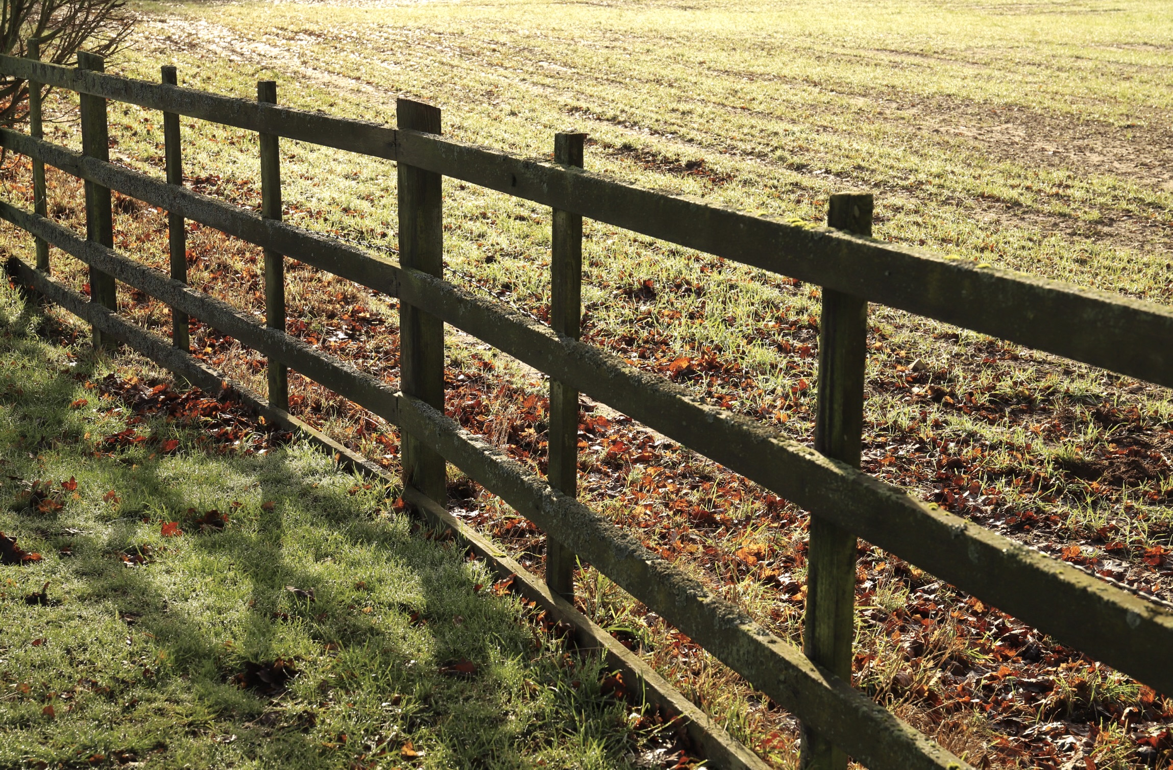
Light shapes how an image feels before anything else is noticed.
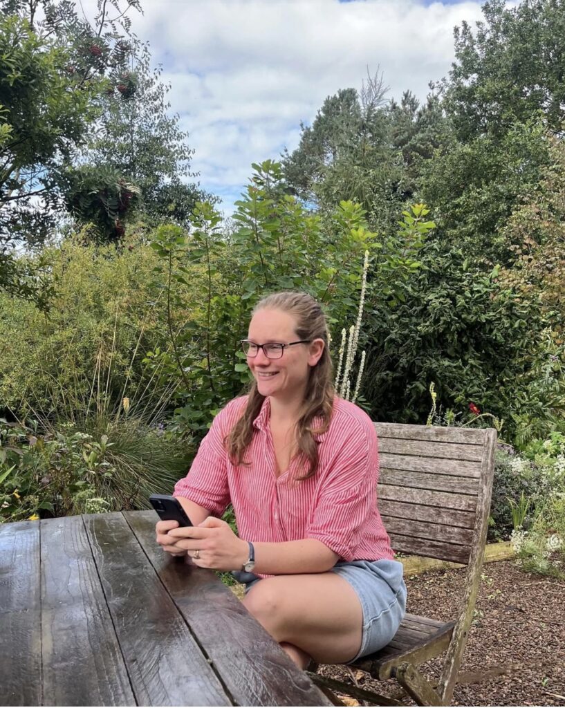
Natural light, especially at the beginning or end of the day, softens features and reduces harsh shadows. It allows people to look like themselves without filters or heavy correction. When light is calm, presence becomes calm too.
A common misunderstanding is that good lighting requires equipment. Many people worry that natural light will make images look dark or unprofessional, so they turn to ring lights, strip lights, or strong filters. In reality, these often introduce harshness rather than softness.
When people see how light behaves naturally, such as turning slowly beside a window and noticing how side light feels gentler than full light, their confidence grows. Good light does not overpower. It supports.
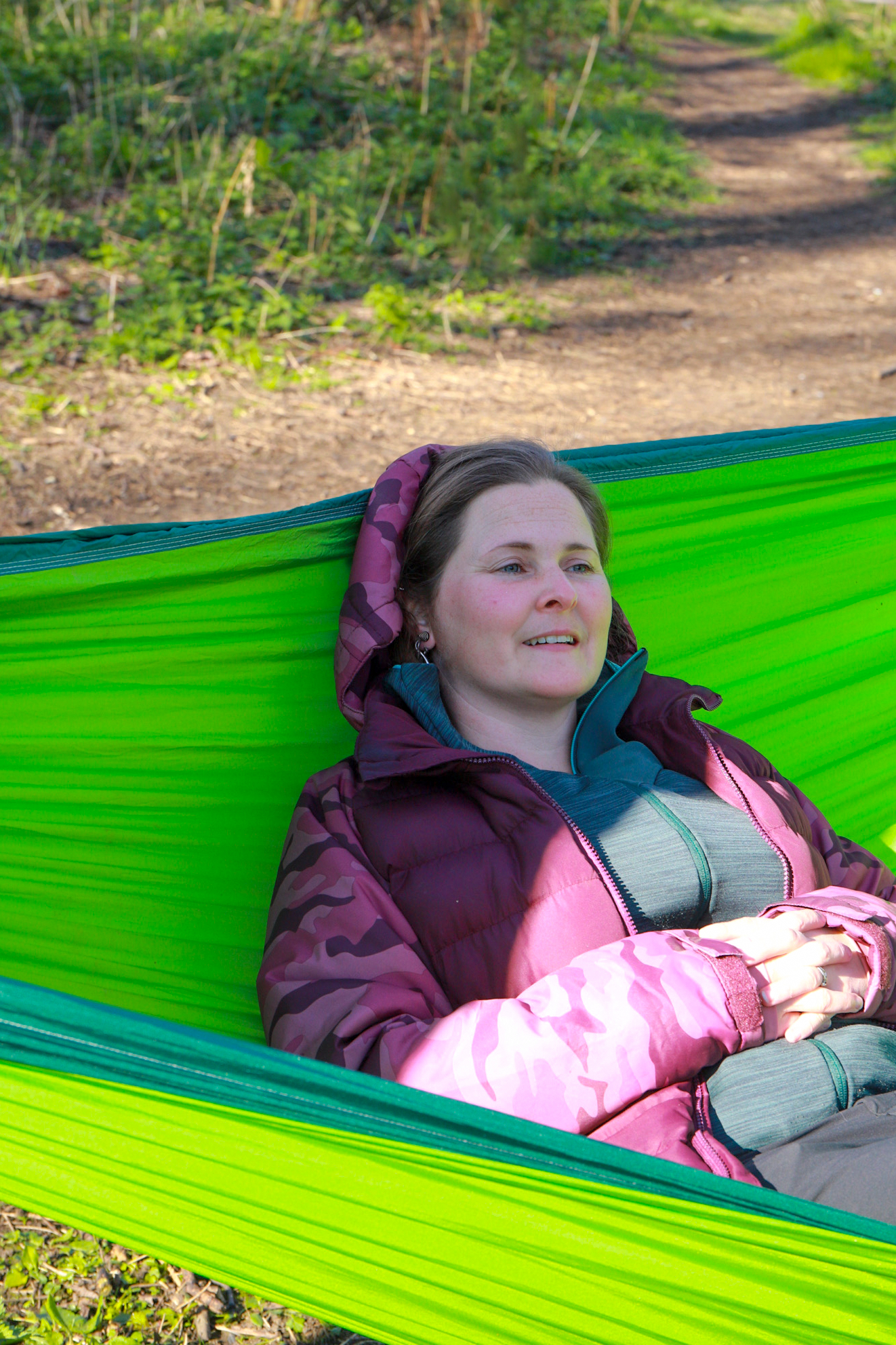
A gentle pose is rarely about holding a position.
It is about letting the body settle. Shoulders soften. Breathing slows. The face relaxes in the way it does when someone familiar enters the room. The most natural images often come from people doing what they already do, reading, writing, holding a cup, or talking.
My approach is to design shoots so clients feel oriented and prepared rather than directed. When people know where they will sit or stand and what will be with them, their nervous system relaxes. From there, ease takes over.
You may find it helpful to explore this further in my posing guide, which focuses on natural movement rather than instruction.
Colour plays a quiet but powerful role in how images are experienced over time.
Rather than following trends, it is more useful to think in terms of emotional temperature. Soft, muted colours tend to communicate calm, steadiness, and safety. When colours remain consistent across your imagery, they become familiar and recognisable, which builds trust.
Colour consistency is not restrictive. It is relational. When your palette reflects your values, such as nature, simplicity, integrity, and space, your images feel connected before any words are read.
This is where visual consistency becomes a trust signal rather than a branding exercise.
Props work best when they feel familiar and considered.
A notebook, a cup, or a pet gives the viewer something to recognise. These objects offer small clues about who you are and how you work. One or two thoughtful props are usually enough. More than that can quickly become visual noise.
My guiding question is always whether the image needs another layer. If the background or environment already carries interest, props may not be necessary. If the setting and clothing are neutral, a simple object can add warmth and context without distraction.
You can read more about this approach in my blog on using props with intention.
Soft imagery is not created by a single choice.
Light, posing, colour, and props work together to create an overall emotional climate. Restraint allows each element to support the others. When everything is softened slightly, the image feels human, calm, and trustworthy.
A gentle reflection
The next time you look at an image, your own or someone else’s, notice what your eye is drawn to first.
Does the image invite you in, or pull at your attention? Does it feel spacious or crowded? Often, the element that grabs attention most strongly is also the one that disrupts connection.
Trust your judgement. You do not need to impress your audience. You need to help them feel at ease.
Softness is not about doing less. It is about choosing what truly matters.